


Sticky Footer
经典的上-中-下布局。
当页面内容高度小于可视区域高度时,footer 吸附在底部;当页面内容高度大于可视区域高度时,footer 被撑开排在 content 下方
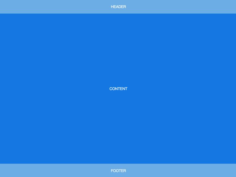
<body>
  <header>HEADER</header>
  <article>CONTENT</article>
  <footer>FOOTER</footer>
</body>
body {
min-height: 100vh;
display: flex;
flex-direction: column;
}
article {
flex: auto;
}Fixed-Width Sidebar
在上-中-下布局的基础上,加了左侧定宽 sidebar。
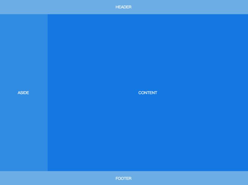
<body>
  <header>HEADER</header>
  <div class="content">
    <aside>ASIDE</aside>
    <article>CONTENT</article>
  </div>
  <footer>FOOTER</footer>
</body>
body {
min-height: 100vh;
display: flex;
flex-direction: column;
}
.content {
flex: auto;
display: flex;
}
.content article {
flex: auto;
}Sidebar
左边是定宽 sidebar,右边是上-中-下布局。
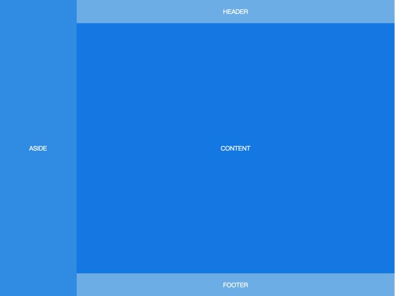
<body>
  <aside>ASIDE</aside>
  <div class="content">
    <header>HEADER</header>
    <article>CONTENT</article>
    <footer>FOOTER</footer>
  </div>
</body>
body {
min-height: 100vh;
display: flex;
}
aside {
flex: none;
}
.content {
flex: auto;
display: flex;
flex-direction: column;
}
.content article {
flex: auto;
}Sticky Header
还是上-中-下布局,区别是 header 固定在顶部,不会随着页面滚动。
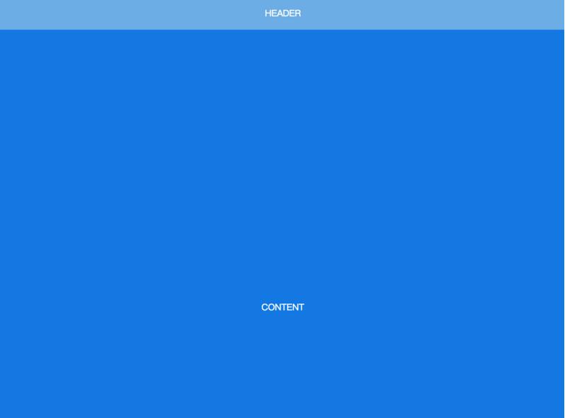
<body>
  <header>HEADER</header>
  <article>CONTENT</article>
  <footer>FOOTER</footer>
</body>
body {
min-height: 100vh;
display: flex;
flex-direction: column;
padding-top: 60px;
}
header {
height: 60px;
position: fixed;
top: 0;
left: 0;
right: 0;
padding: 0;
}
article {
flex: auto;
height: 1000px;
}Sticky Sidebar
左侧 sidebar 固定在左侧且与视窗同高,当内容超出视窗高度时,在 sidebar 内部出现滚动条。左右两侧滚动条互相独立。
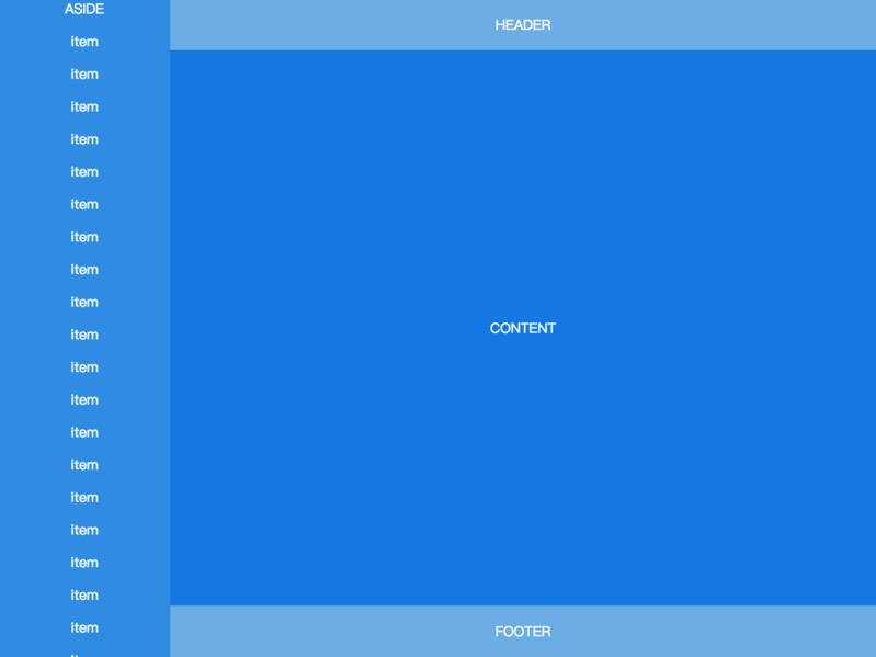
<body>
  <aside>
    ASIDE
    <p>item</p>
    <p>item</p>
    <!-- many items -->
    <p>item</p>
  </aside>
  <div class="content">
    <header>HEADER</header>
    <article>CONTENT</article>
    <footer>FOOTER</footer>
  </div>
</body>
body {
height: 100vh;
display: flex;
}
aside {
flex: none;
width: 200px;
overflow-y: auto;
display: block;
}
.content {
flex: auto;
display: flex;
flex-direction: column;
overflow-y: auto;
}
.content article {
flex: auto;
}
来源:https://github.com/meikidd/flex-layout
本文内容仅供个人学习/研究/参考使用,不构成任何决策建议或专业指导。分享/转载时请标明原文来源,同时请勿将内容用于商业售卖、虚假宣传等非学习用途哦~感谢您的理解与支持!
css两端对齐——div+css布局实现2端对齐的4种方法总结
css两端对齐,通过margin负值、justify、space-between、column-count等多种方式来实现css的两端对齐。
flex布局,学习flex弹性布局总结
flex布局(Flexible Box)是对界面css盒模型的一个优化,适应不同尺寸的屏幕,被定义flex的容器可以控制子元素的排列方向和大小,能够用更简单清晰的代码来完成复杂的布局。
html通过css,js实现div悬浮效果总汇,如原生JS实现滚动到一定位置实现div悬浮
在我们的实际开发中,经常会遇到页面中需要悬浮效果,本文将介绍通过fixed的实现,以及通过原生Js实现滚动到一定位置,实现div的悬浮
理解css中Grid布局,在项目中如何实现grid页面布局
CSS中Grid是一种二维网格式布局方式,Grid是为了解决二维布局问题而创建的CSS模块。使用Gird的好处,Gird在浏览器的兼容性,Grid布局的示例源码...
你以为 CSS 只是个简单的布局?
本文中,所有的图形都是在单个标签内实现的,大量使用了 CSS3 中的 ::before 、::after 伪元素,transparent 、border,多重线性与径向渐变,多重内外阴影,如果你的效果不尽人意,请尝试在 Chrome 浏览器下预览。
html实现时间轴_纯css实现响应式竖着/垂直时间抽布局效果
html实现用时间点来展示事件发生点来代替用table展示一条条数据,能够给人清晰、一目了然能够看清事情发生的过程,UI页面也显示的那么清晰。如何用css+html做出时间轴展示事件点的?
基于jquery 横向/纵向 时间轴插件推荐
这篇文章主要整理一些关于基于jquery,实现横向/纵向时间轴的插件推荐:jquery.jqtimeline插件、timeline.js插件、Timeglider.js插件、Melon HTML5 、jQuery Timelinr、Timeline Porfolio

CSS position 属性_css中常用position定位属性介绍
css可以通过为元素设置一个position属性值,position定位是指定位置的定位,以下为常用的几种:static(静态定位)、relative定位(相对定位)、absolute定位(绝对定位)、fixed(固定定位)、inherit定位
css圣杯布局的实现方式
css圣杯布局思路:外面一个大div,里面三个小div(都是浮动)。实现左右两栏宽度固定,中间宽度自适应。中间栏优先渲染。

JQuery实现的固定位置下拉隐藏上拉显示悬浮导航菜单
JQuery实现:1、页面打开时,导航栏悬浮的页面上部 2、页面向下拉的时候导航栏隐藏 3、页面向上拉的时候导航栏出现。
内容以共享、参考、研究为目的,不存在任何商业目的。其版权属原作者所有,如有侵权或违规,请与小编联系!情况属实本人将予以删除!