


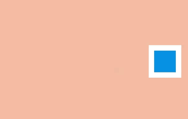
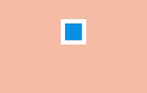
一、挤压和拉伸 (Squash and stretch)
<article>
    <div></div>
    <div></div>
  </article>
.one .shape {
  animation: one 4s infinite ease-out;
}

.one .surface {
  background: #000;
  height: 10em;
  width: 1em;
  position: absolute;
  top: calc(50% - 4em);
  left: calc(50% + 10em);
}

@keyframes one {
  0%, 15% {
    opacity: 0;
  }
  15%, 25% {
    transform: none;
    animation-timing-function: cubic-bezier(1,-1.92,.95,.89);
    width: 4em;
    height: 4em;
    top: calc(50% - 2em);
    left: calc(50% - 2em);
    opacity: 1;
  }
  35%, 45% {
    transform: translateX(8em);
    height: 6em;
    width: 2em;
    top: calc(50% - 3em);
    animation-timing-function: linear;
    opacity: 1;
  }
  70%, 100% {
    transform: translateX(8em) translateY(5em);
    height: 6em;
    width: 2em;
    top: calc(50% - 3em);
    opacity: 0;
  }
}

body {
  margin: 0;
  background: #e9b59f;
  font-family: HelveticaNeue, Arial, Sans-serif;
  color: #fff;
}

.principle {
  width: 100%;
  height: 100vh;
  position: relative;
}

.shape {
  background: #2d97db;
  border: 1em solid #fff;
  width: 4em;
  height: 4em;
  position: absolute;
  top: calc(50% - 2em);
  left: calc(50% - 2em);
}
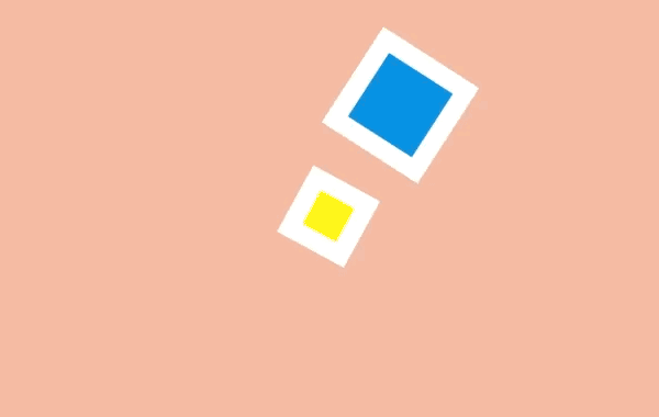
二、预备动作 (Anticipation)
<article>
    <div></div>
    <div></div>
  </article>
.two .shape {
  animation: two 5s infinite ease-out;
  transform-origin: 50% 7em;
}

.two .surface {
  background: #000;
  width: 8em;
  height: 1em;
  position: absolute;
  top: calc(50% + 4em);
  left: calc(50% - 3em);
}

@keyframes two {
  0%, 15% {
    opacity: 0;
    transform: none;
  }
  15%, 25% {
    opacity: 1;
    transform: none;
    animation-timing-function: cubic-bezier(.5,.05,.91,.47);
  }
  28%, 38% {
    transform: translateX(-2em);
  }
  40%, 45% {
    transform: translateX(-4em);
  }
  50%, 52% {
    transform: translateX(-4em) rotateZ(-20deg);
  }
  70%, 75% {
    transform: translateX(-4em) rotateZ(-10deg);
  }
  78% {
    transform: translateX(-4em) rotateZ(-24deg);
    opacity: 1;
  }
  86%, 100% {
    transform: translateX(-6em) translateY(4em) rotateZ(-90deg);
    opacity: 0;
  }
}
.principle {
  width: 100%;
  height: 100vh;
  position: relative;
}

.shape {
  background: #2d97db;
  border: 1em solid #fff;
  width: 4em;
  height: 4em;
  position: absolute;
  top: calc(50% - 2em);
  left: calc(50% - 2em);
}
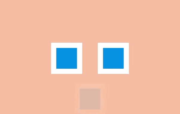
三、演出布局 (Staging)
<article>
    <div></div>
    <div></div>
    <div></div>
  </article>
.three .shape.a {
  transform: translateX(-12em);
}

.three .shape.c {
  transform: translateX(12em);
}

.three .shape.b {
  animation: three 5s infinite ease-out;
  transform-origin: 0 6em;
}

.three .shape.a, .three .shape.c {
  animation: threeb 5s infinite linear;
}

@keyframes three {
  0%, 10% {
    transform: none;
    animation-timing-function: cubic-bezier(.57,-0.5,.43,1.53);
  }
  26%, 30% {
    transform: rotateZ(-40deg);
  }
  32.5% {
    transform: rotateZ(-38deg);
  }
  35% {
    transform: rotateZ(-42deg);
  }
  37.5% {
    transform: rotateZ(-38deg);
  }
  40% {
    transform: rotateZ(-40deg);
  }
  42.5% {
    transform: rotateZ(-38deg);
  }
  45% {
    transform: rotateZ(-42deg);
  }
  47.5% {
    transform: rotateZ(-38deg);
    animation-timing-function: cubic-bezier(.57,-0.5,.43,1.53);
  }
  58%, 100% {
    transform: none;
  }
}

@keyframes threeb {
  0%, 20% {
    filter: none;
  }
  40%, 50% {
    filter: blur(5px);
  }
  65%, 100% {
    filter: none;
  }
}

.principle {
  width: 100%;
  height: 100vh;
  position: relative;
}

.shape {
  background: #2d97db;
  border: 1em solid #fff;
  width: 4em;
  height: 4em;
  position: absolute;
  top: calc(50% - 2em);
  left: calc(50% - 2em);
}
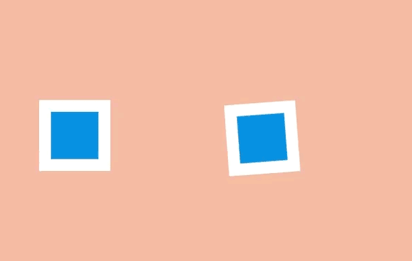
四、连续运动和姿态对应 (Straight-Ahead Action and Pose-to-Pose)
<article>
    <div></div>
    <div></div>
  </article>
.four .shape.a {
    left: calc(50% - 8em);
    animation: four 6s infinite cubic-bezier(.57,-0.5,.43,1.53);
}

.four .shape.b {
  left: calc(50% + 8em);
  animation: four 6s infinite steps(1);
}

@keyframes four {
  0%, 10% {
    transform: none;
  }
  26%, 30% {
    transform: rotateZ(-45deg) scale(1.25);
  }
  40% {
    transform: rotateZ(-45deg) translate(2em, -2em) scale(1.8);
  }
  50%, 75% {
    transform: rotateZ(-45deg) scale(1.1);
  }
  90%, 100% {
    transform: none;
  }
}

.principle {
  width: 100%;
  height: 100vh;
  position: relative;
}

.shape {
  background: #2d97db;
  border: 1em solid #fff;
  width: 4em;
  height: 4em;
  position: absolute;
  top: calc(50% - 2em);
  left: calc(50% - 2em);
}
五、跟随和重叠动作 (Follow Through and Overlapping Action)

 <article>
    <div>
      <div></div>
    </div>
  </article>
.five .shape {
  animation: five 4s infinite cubic-bezier(.64,-0.36,.1,1);
  position: relative;
  left: auto;
  top: auto;
}

.five .shape-container {
  animation: five-container 4s infinite cubic-bezier(.64,-0.36,.1,2);
  position: absolute;
  left: calc(50% - 4em);
  top: calc(50% - 4em);
}

@keyframes five {
  0%, 15% {
    opacity: 0;
    transform: translateX(-12em);
  }
  15%, 25% {
    transform: translateX(-12em);
    opacity: 1;
  }
  85%, 90% {
    transform: translateX(12em);
    opacity: 1;
  }
  100% {
    transform: translateX(12em);
    opacity: 0;
  }
}

@keyframes five-container {
  0%, 35% {
    transform: none;
  }
  50%, 60% {
    transform: skewX(20deg);
  }
  90%, 100% {
    transform: none;
  }
}
.principle {
  width: 100%;
  height: 100vh;
  position: relative;
}

.shape {
  background: #2d97db;
  border: 1em solid #fff;
  width: 4em;
  height: 4em;
  position: absolute;
  top: calc(50% - 2em);
  left: calc(50% - 2em);
}
六、缓入缓出 (Slow In and Slow Out)
 <article>
    <div></div>
  </article>
.six .shape {
  animation: six 3s infinite cubic-bezier(0.5,0,0.5,1);
}

@keyframes six {
  0%, 5% {
    transform: translate(-12em);
  }
  45%, 55% {
    transform: translate(12em);
  }
  95%, 100% {
    transform: translate(-12em);
  }
}

.principle {
  width: 100%;
  height: 100vh;
  position: relative;
}

.shape {
  background: #2d97db;
  border: 1em solid #fff;
  width: 4em;
  height: 4em;
  position: absolute;
  top: calc(50% - 2em);
  left: calc(50% - 2em);
}
七、弧线运动 (Arc)

<article>
    <div></div>
    <div></div>
  </article>
.sevenb .shape.a {
  animation: sevenb 3s infinite linear;
  top: calc(50% - 2em);
  left: calc(50% - 9em);
  transform-origin: 10em 50%;
}
.sevenb .shape.b {
  animation: sevenb 6s infinite linear reverse;
  background-color: yellow;
  width: 2em;
  height: 2em;
  left: calc(50% - 1em);
  top: calc(50% - 1em);
}

@keyframes sevenb {
  100% {
    transform: rotateZ(360deg);
  }
}

.principle {
  width: 100%;
  height: 100vh;
  position: relative;
}

.shape {
  background: #2d97db;
  border: 1em solid #fff;
  width: 4em;
  height: 4em;
  position: absolute;
  top: calc(50% - 2em);
  left: calc(50% - 2em);
}
八、次要动作 (Secondary Action)
<article>
    <div></div>
    <div></div>
    <div></div>
  </article>
.eight .shape.a {
  transform: translateX(-6em);
  animation: eight-shape-a 4s cubic-bezier(.57,-0.5,.43,1.53) infinite;
}
.eight .shape.b {
  top: calc(50% + 6em);
  opacity: 0;
  animation: eight-shape-b 4s linear infinite;
}
.eight .shape.c {
  transform: translateX(6em);
  animation: eight-shape-c 4s cubic-bezier(.57,-0.5,.43,1.53) infinite;
}

@keyframes eight-shape-a {
  0%, 50% {
    transform: translateX(-5.5em);
  }
  70%, 100% {
    transform: translateX(-10em);
  }
}

@keyframes eight-shape-b {
  0% {
    transform: none;
  }
  20%, 30% {
    transform: translateY(-1.5em);
    opacity: 1;
    animation-timing-function: cubic-bezier(.57,-0.5,.43,1.53);
  }
  32% {
    transform: translateY(-1.25em);
    opacity: 1;
  }
  34% {
    transform: translateY(-1.75em);
    opacity: 1;
  }
  36%, 38% {
    transform: translateY(-1.25em);
    opacity: 1;
  }
  42%, 60% {
    transform: translateY(-1.5em);
    opacity: 1;
  }
  75%, 100% {
    transform: translateY(-8em);
    opacity: 1;
  }
}

@keyframes eight-shape-c {
  0%, 50% {
    transform: translateX(5.5em);
  }
  70%, 100% {
    transform: translateX(10em);
  }
}

.principle {
  width: 100%;
  height: 100vh;
  position: relative;
}

.shape {
  background: #2d97db;
  border: 1em solid #fff;
  width: 4em;
  height: 4em;
  position: absolute;
  top: calc(50% - 2em);
  left: calc(50% - 2em);
}
九、时间节奏 (Timing)
<article>
    <div></div>
    <div></div>
  </article>
.nine .shape.a {
  animation: nine 4s infinite cubic-bezier(.93,0,.67,1.21);
  left: calc(50% - 12em);
  transform-origin: 100% 6em;
}
.nine .shape.b {
  animation: nine 2s infinite cubic-bezier(1,-0.97,.23,1.84);
  left: calc(50% + 2em);
  transform-origin: 100% 100%;
}

@keyframes nine {
  0%, 10% {
    transform: translateX(0);
  }
  40%, 60% {
    transform: rotateZ(90deg);
  }
  90%, 100% {
    transform: translateX(0);
  }
}
.principle {
  width: 100%;
  height: 100vh;
  position: relative;
}

.shape {
  background: #2d97db;
  border: 1em solid #fff;
  width: 4em;
  height: 4em;
  position: absolute;
  top: calc(50% - 2em);
  left: calc(50% - 2em);
}
十、夸张手法 (Exaggeration)
<article>
    <div></div>
  </article>
.ten .shape {
  animation: ten 4s infinite linear;
  transform-origin: 50% 8em;
  top: calc(50% - 6em);
}

@keyframes ten {
  0%, 10% {
    transform: none;
    animation-timing-function: cubic-bezier(.87,-1.05,.66,1.31);
  }
  40% {
    transform: rotateZ(-45deg) scale(2);
    animation-timing-function: cubic-bezier(.16,.54,0,1.38);
  }
  70%, 100% {
    transform: rotateZ(360deg) scale(1);
  }
}

.principle {
  width: 100%;
  height: 100vh;
  position: relative;
}

.shape {
  background: #2d97db;
  border: 1em solid #fff;
  width: 4em;
  height: 4em;
  position: absolute;
  top: calc(50% - 2em);
  left: calc(50% - 2em);
}
十一、扎实的描绘 (Solid drawing)

<article>
    <div>
      <div>
        <span></span>
        <span></span>
        <span></span>
        <span></span>
        <span></span>
        <span></span>
      </div>
    </div>
  </article>
.eleven .shape {
  background: none;
  border: none;
  perspective: 400px;
  perspective-origin: center;
}
.eleven .shape .container {
  animation: eleven 4s infinite cubic-bezier(.6,-0.44,.37,1.44);
  transform-style: preserve-3d;
}
.eleven .shape span {
    display: block;
    position: absolute;
    opacity: 1;
    width: 4em;
    height: 4em;
    border: 1em solid #fff;
    background: #2d97db;
}
.eleven .shape span.front {
  transform: translateZ(3em);
}
.eleven .shape span.back {
  transform: translateZ(-3em);
}
.eleven .shape span.left {
  transform: rotateY(-90deg) translateZ(-3em);
}
.eleven .shape span.right {
  transform: rotateY(-90deg) translateZ(3em);
}
.eleven .shape span.top {
  transform: rotateX(-90deg) translateZ(-3em);
}
.eleven .shape span.bottom {
  transform: rotateX(-90deg) translateZ(3em);
}


@keyframes eleven {
  0% {
    opacity: 0;
  }
  10%, 40% {
    transform: none;
    opacity: 1;
  }
  60%, 75% {
    transform: rotateX(-20deg) rotateY(-45deg) translateY(4em);
    animation-timing-function: cubic-bezier(1,-0.05,.43,-0.16);
    opacity: 1;
  }
  100% {
    transform: translateZ(-180em) translateX(20em);
    opacity: 0;
  }
}

.principle {
  width: 100%;
  height: 100vh;
  position: relative;
}

.shape {
  background: #2d97db;
  border: 1em solid #fff;
  width: 4em;
  height: 4em;
  position: absolute;
  top: calc(50% - 2em);
  left: calc(50% - 2em);
}
十二、吸引力 (Appeal)

<article>
    <div>
      <div>
        <span></span>
        <span></span>
        <span></span>
        <span></span>
      </div>
    </div>
  </article>
.twelve .shape {
  background: none;
  border: none;
  perspective: 400px;
  perspective-origin: center;
}

.twelve .shape .container {
  animation: show-container 8s infinite cubic-bezier(.6,-0.44,.37,1.44);
  transform-style: preserve-3d;
  width: 4em;
  height: 4em;
  border: 1em solid #fff;
  background: #2d97db;
  position: relative;
}

.twelve .item {
  background-color: #1f7bb6;
  position: absolute;
}

.twelve .item.one {
  animation: show-text 8s 0.1s infinite ease-out;
  height: 6%;
  width: 30%;
  top: 15%;
  left: 25%;
}

.twelve .item.two {
  animation: show-text 8s 0.2s infinite ease-out;
  height: 6%;
  width: 20%;
  top: 30%;
  left: 25%;
}

.twelve .item.three {
  animation: show-text 8s 0.3s infinite ease-out;
  height: 6%;
  width: 50%;
  top: 45%;
  left: 25%;
}

.twelve .item.four {
  animation: show-button 8s infinite cubic-bezier(.64,-0.36,.1,1.43);
  height: 20%;
  width: 40%;
  top: 65%;
  left: 30%;
}

@keyframes show-container {
  0% {
    opacity: 0;
    transform: rotateX(-90deg);
  }
  10% {
    opacity: 1;
    transform: none;
    width: 4em;
    height: 4em;
  }
  15%, 90% {
    width: 12em;
    height: 12em;
    transform: translate(-4em, -4em);
    opacity: 1;
  }
  100% {
    opacity: 0;
    transform: rotateX(-90deg);
    width: 4em;
    height: 4em;
  }
}

@keyframes show-text {
  0%, 15% {
    transform: translateY(1em);
    opacity: 0;
  }
  20%, 85% {
    opacity: 1;
    transform: none;
  }
  88%, 100% {
    opacity: 0;
    transform: translateY(-1em);
    animation-timing-function: cubic-bezier(.64,-0.36,.1,1.43);
  }
}

@keyframes show-button {
  0%, 25% {
    transform: scale(0);
    opacity: 0;
  }
  35%, 80% {
    transform: none;
    opacity: 1;
  }
  90%, 100% {
    opacity: 0;
    transform: scale(0);
  }
}

.principle {
  width: 100%;
  height: 100vh;
  position: relative;
}

.shape {
  background: #2d97db;
  border: 1em solid #fff;
  width: 4em;
  height: 4em;
  position: absolute;
  top: calc(50% - 2em);
  left: calc(50% - 2em);
}
译者:@Ethon Lau
译文:https://cssanimation.rocks/cn/principles/
作者:@donovanh
原文:https://cssanimation.rocks/principles/
本文内容仅供个人学习/研究/参考使用,不构成任何决策建议或专业指导。分享/转载时请标明原文来源,同时请勿将内容用于商业售卖、虚假宣传等非学习用途哦~感谢您的理解与支持!
纯CSS3实现各种表情动画
CSS3非常强大,我们可以利用CSS3相关特性绘制很多平面图形,并且可以制作很多简单的动画。今天要分享的是一款用纯CSS3实现的可爱表情动画
Vue.js动画笔记_vue实现动画效果
Vue.js中的元素动画或页面跳转动画有多种实现方式比如:1、自己手动写CSS3动画来实现2、使用第三方CSS动画库如:Animate.css3、在构子函数中操作DOM4、使用第三方Js动画库如:Velocity.js。
新手引导动画的4种实现方式
尽量多的列举出新手引导动画的实现方式, 昨天稍微总结了一下, 实现了4种.源码在最后,如果想直接看结果的,可以拉到最后去看.这里假设所有的弹出层都是基于页面上原有的元素

为何 Canvas 内元素动画总是在颤抖?
在项目中我们可能对动画进行锁帧,帧率可能是 60 或者 30,如果我们想保证渲染不抖动,在匀速直线运动中,我们尽量保证我们设置的速度要是帧率的倍数,或者保证平均每帧移动的像素点是一样的
前端开发常用css动画代码
常用的CSS动画效果,在实际开发中经常需要用到移动、大小、闪烁、渐显、渐隐等动画效果,这篇文章就整理了些常见的动画效果分享给大家,一遍收藏使用。

css环形滚动_内容加载的环形滚动动画效果
创建一个没有背景的圆,然后声明透明度为0.1的黑色边框(看起来是灰色),修改左侧边框颜色。此时会有一个静态的看起来只有左边框有颜色的空心圆。然后声明一个该元素逆时针旋转360度的动画,并让该动画无限播放(infinite)即可
css transition 实现滑入滑出
transition是css最简单的动画。 通常当一个div属性变化时,我们会立即看的变化,从旧样式到新样式是一瞬间的,嗖嗖嗖!!!但是,如果我希望是慢慢的从一种状态,转变成另外一种状态,怎么办? transition可以做到。
动画函数的绘制及自定义动画函数
制作动画效果离不开动画运动函数,而我们用得最多的无疑就是Tween.js。根据不同的数学公式原理,Tween.js划分出了不同的动画类型,每种动画类型里面都包含以下的缓动类型:ease in 先慢后快、ease out 先块后慢、ease in out 先慢后快再慢
超酷的CSS3 loading预加载动画特效
这是一款超酷CSS3 loading预加载动画特效。该loading特效共有4种不同的效果,分别通过不同的CSS3 keyframes帧动画来完成。HTML结构:4种loading预加载动画的HTML结构分别如下
Vue 动画的封装
js提供的钩子动画before-enter、enter、after-enter,用这种方法写,所有的动画都写在了组件里,外部只需要调用这个fade组件就可以了,也不需要全局去写一些样式了,这种动画的封装是比较推荐的一种动画封装,因为它可以把所有动画的实现完整的封装在一个组件中
内容以共享、参考、研究为目的,不存在任何商业目的。其版权属原作者所有,如有侵权或违规,请与小编联系!情况属实本人将予以删除!