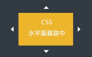
html 元素垂直水平居中
一、 不定宽高元素水平垂直居中
1、transform: translate()
<div class="wrapper">
    <p class="center">水平垂直居中</p>
</div>

.wrapper{
    background-color: #eee;
    height:200px;
}
.center{
    position: relative;
    width: 300px;
    padding: 10px 20px;
    background-color: #2c3e50;
    color: #fff;
    left: 50%;
    right: 50%;
    transform: translate(-50%, -50%);
}
缺点:IE9以下不兼容
2、flex 布局,利用justify-content和align-items 实现居中
<div class="wrapper">
<p class="center3">水平垂直居中</p>
</div>

.wrapper{
    height:200px;
    background-color: #eee;
    display: flex;
    justify-content: center;
    align-items: center;
}
.center2 {
    position: relative;
    width: 300px;
    padding: 10px 20px;
    background-color: #2c3e50;
    color: #fff;
}
3、使用table+table-cell实现垂直居中,display:inline-block;或margin: auto;实现水平居中
<div class="wrapper">
    <div class="content">
        <p class="center3">水平垂直居中</p>
    </div>
</div>

.wrapper{
    background-color: #eee;
    height: 200px;
    width: 100%;
    display: table;
}
.content {
    display: table-cell;
    text-align: center;
    vertical-align: middle;
}
.center3 {
    display: inline-block;
    width: 300px;
    padding: 10px 20px;
    background-color: #2c3e50;
    color: #fff;
}
4、伪元素:after, :before 使用inline-block+ vertical-align:middle 对齐伪元素
<div class="wrapper">
    <p class="center4">水平垂直居中</p>
</div>
.wrapper {
    background-color: #eee;
    height: 200px;
    width: 100%;
    position: relative;
}
.wrapper:after {
    content: '';
    display: inline-block;
    vertical-align: middle;
    height: 100%;
}
.center4 {
    background-color:#2c3e50;
    padding: 10px 20px;
    color:#fff;
    display: inline-block;
}
5、writing-mode: 改变文字的显示方向
<div class="wrapper">
    <div class="content">
        <p class="center5">水平垂直居中</p>
    </div>
</div>

.wrapper {
    background-color:#eee;
    width: 100%;
    height: 200px;
    writing-mode: vertical-lr;
}
.content {
    writing-mode: horizontal-tb;
    display: inline-block;
    width: 100%;
}
.center5 {
    background-color:#2c3e50;
    padding: 10px 20px;
    color:#fff;
    display: inline-block;
    margin: auto;
    text-align: left;
}
二、 固定宽高元素水平垂直居中
6、absolute+ 负margin
<div class="wrapper">
    <p class="center6">水平垂直居中</p>
</div>
 .wrapper {
     background-color: #eee;
     height: 200px;
     width: 100%;
     position: relative;
 }
 .center6{
     background-color: #2c3e50;
     color: #fff;
     width: 300px;
     height: 50px;
     line-height: 50px;
     position: absolute;
     top: 50%;
     left: 50%;
     margin-left: -150px;
     margin-top: -25px;
 }
设置绝对定位,left:50%; top: 50%;使当前元素的左上角处于父元素的中心位置, 再利用负margin使其中心位于父元素的中心。
7、absolute+ 上下左右等值
<div class="wrapper">
    <p class="center7">水平垂直居中</p>
</div>
.wrapper {
    background-color: #eee;
    height: 200px;
    width: 100%;
    position: relative;
}
.center7 {
    background-color: #2c3e50;
    color: #fff;
    width: 300px;
    height: 50px;
    line-height: 50px;
    position: absolute;
    top: 0;
    left: 0;
    right: 0;
    bottom: 0;
    margin: auto;
}
本文内容仅供个人学习、研究或参考使用,不构成任何形式的决策建议、专业指导或法律依据。未经授权,禁止任何单位或个人以商业售卖、虚假宣传、侵权传播等非学习研究目的使用本文内容。如需分享或转载,请保留原文来源信息,不得篡改、删减内容或侵犯相关权益。感谢您的理解与支持!