


利用 css 来实现对象的垂直居中有许多不同的方法,比较难的是选择那个正确的方法。我下面说明一下我看到的好的方法和怎么来创建一个好的居中网站。
使用 CSS 实现垂直居中并不容易。有些方法在一些浏览器中无效。下面我们看一下使对象垂直集中的5种不同方法,以及它们各自的优缺点。
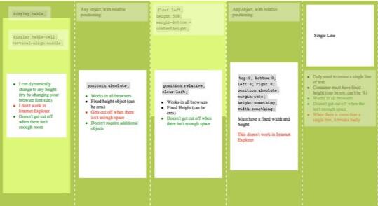
方法一
这个方法把一些 div 的显示方式设置为表格,因此我们可以使用表格的 vertical-align property 属性。
<div id="wrapper">
	<div id="cell">
		<div class="content">Content goes here</div>
	</div>
</div>
#wrapper {
	display: table;
}

#cell {
	display: table-cell;
	vertical-align: middle;
}
优点:
- content 可以动态改变高度(不需在 CSS 中定义)。当 wrapper 里没有足够空间时, content 不会被截断
缺点:
- Internet Explorer(甚至 IE8 beta)中无效,许多嵌套标签(其实没那么糟糕,另一个专题)
方法二:
这个方法使用绝对定位的 div,把它的 top 设置为 50%,top margin 设置为负的 content 高度。这意味着对象必须在 CSS 中指定固定的高度。
因为有固定高度,或许你想给 content 指定 overflow:auto,这样如果 content 太多的话,就会出现滚动条,以免content 溢出。
<div class="content"> Content goes here</div>
#content {
	position: absolute;
	top: 50%;
	height: 240px;
	margin-top: -120px; /* negative half of the height */
}
优点:
- 适用于所有浏览器
- 不需要嵌套标签
缺点:
- 没有足够空间时,content 会消失(类似div 在 body 内,当用户缩小浏览器窗口,滚动条不出现的情况)
方法三
这种方法,在 content 元素外插入一个 div。设置此 div height:50%; margin-bottom:-contentheight;。
content 清除浮动,并显示在中间。
<div id="floater">
	<div id="content">Content here</div>
</div>
#floater {
	float: left;
	height: 50%;
	margin-bottom: -120px;
}

#content {
	clear: both;
	height: 240px;
	position: relative;
}
优点:
- 适用于所有浏览器
- 没有足够空间时(例如:窗口缩小) content 不会被截断,滚动条出现
缺点:
- 唯一我能想到的就是需要额外的空元素了(也没那么糟,又是另外一个话题)
方法四
这个方法使用了一个 position:absolute,有固定宽度和高度的 div。这个 div 被设置为 top:0; bottom:0;。但是因为它有固定高度,其实并不能和上下都间距为 0,因此 margin:auto; 会使它居中。使用 margin:auto;使块级元素垂直居中是很简单的。
<div id="content"> Content here</div>
#content {
	position: absolute;
	top: 0;
	bottom: 0;
	left: 0;
	right: 0;
	margin: auto;
	height: 240px;
	width: 70%;
}
优点:
- 简单
缺点:
- IE(IE8 beta)中无效
- 无足够空间时,content 被截断,但是不会有滚动条出现
方法五
这个方法只能将单行文本置中。只需要简单地把 line-height 设置为那个对象的 height 值就可以使文本居中了。
<div id="content"> Content here</div>
#content {
	height: 100px;
	line-height: 100px;
}
优点:
- 适用于所有浏览器
- 无足够空间时不会被截断
缺点:
- 只对文本有效(块级元素无效)
- 多行时,断词比较糟糕
这个方法在小元素上非常有用,例如使按钮文本或者单行文本居中。
哪个方法?
我最喜欢的是方法三,缺点不多。因为 content 会清除浮动,所以可以在它上面放置别的元素,并且当窗口缩放时,
居中的 content 不会把另外的元素盖住。
<div id="top">
	<h1>Title</h1>
</div>
<div id="floater"></div>
<div id="content">Content Here</div>
#floater {
	float: left;
	height: 50%;
	margin-bottom: -120px;
}

#top {
	float: right;
	width: 100%;
	text-align: center;
}

#content {
	clear: both;
	height: 240px;
	position: relative;
}
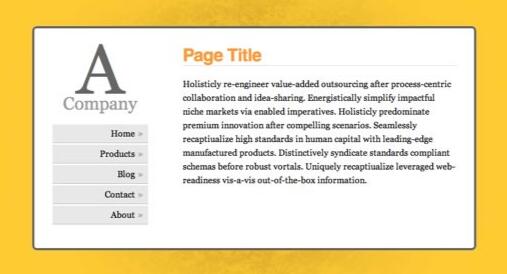
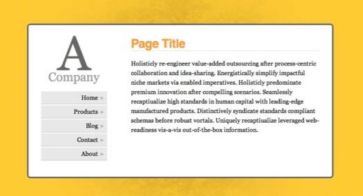
现在你知道是怎么回事了,现在我们开始创建一个简单但是有趣的网站。最终的样子是这样的:
步骤一
以语义化标签开始是很好的。下面是我们的页面构成:
#floater (to push the content into the middle)
	#centred (the centre box)

		#side

			#logo
			#nav (unordered list <ul>)

		#content

	#bottom (for copyright, etc.)
<!DOCTYPE html PUBLIC "-//W3C//DTD XHTML 1.0 Transitional//EN" "http://www.w3.org/TR/xhtml1/DTD/xhtml1-transitional.dtd">
<html xmlns="http://www.w3.org/1999/xhtml">
<head>
<meta http-equiv="Content-Type" content="text/html; charset=UTF-8" />
<title>A Centred Company</title>
<link rel="stylesheet" href="styles.css" type="text/css" media="all" />
</head>

<body>
	<div id="floater"></div>
	<div id="centered">

		<div id="side">
			<div id="logo">
				<strong><span>A</span> Company</strong>
			</div>
			<ul id="nav">
				<li><a href="#">Home</a></li>
				<li><a href="#">Products</a></li>
				<li><a href="#">Blog</a></li>
				<li><a href="#">Contact</a></li>
				<li><a href="#">About</a></li>
			</ul>
		</div>

		<div id="content">

			<h1>Page Title</h1>

			<p>Holisticly re-engineer value-added outsourcing after
				process-centric collaboration and idea-sharing. Energistically
				simplify impactful niche markets via enabled imperatives. Holisticly
				predominate premium innovation after compelling scenarios.
				Seamlessly recaptiualize high standards in human capital with
				leading-edge manufactured products. Distinctively syndicate
				standards compliant schemas before robust vortals. Uniquely
				recaptiualize leveraged web-readiness vis-a-vis out-of-the-box
				information.</p>

			<h2>Heading 2</h2>

			<p>Efficiently embrace customized web-readiness rather than
				customer directed processes. Assertively grow cross-platform
				imperatives vis-a-vis proactive technologies. Conveniently empower
				multidisciplinary meta-services without enterprise-wide interfaces.
				Conveniently streamline competitive strategic theme areas with
				focused e-markets. Phosfluorescently syndicate world-class
				communities vis-a-vis value-added markets. Appropriately reinvent
				holistic services before robust e-services.</p>

		</div>

	</div>

	<div id="bottom">
		<p>Copyright notice goes here</p>
	</div>
</body>
</html>
步骤二:
现在我们开始用一些基本的 CSS 来给页面添加样式。把以下代码放入在我们的 html 页面顶部被引入的 style.css。
html, body {
	margin: 0;
	padding: 0;
	height: 100%;
}

body {
	background: url('page_bg.jpg') 50% 50% no-repeat #FC3;
	font-family: Georgia, Times, serifs;
}

#floater {
	position: relative;
	float: left;
	height: 50%;
	margin-bottom: -200px;
	width: 1px;
}

#centered {
	position: relative;
	clear: left;
	height: 400px;
	width: 80%;
	max-width: 800px;
	min-width: 400px;
	margin: 0 auto;
	background: #fff;
	border: 4px solid #666;
}

#bottom {
	position: absolute;
	bottom: 0;
	right: 0;
}

#nav {
	position: absolute;
	left: 0;
	top: 0;
	bottom: 0;
	right: 70%;
	padding: 20px;
	margin: 10px;
}

#content {
	position: absolute;
	left: 30%;
	right: 0;
	top: 0;
	bottom: 0;
	overflow: auto;
	height: 340px;
	padding: 20px;
	margin: 10px;
}
#centered {
	-webkit-border-radius: 8px;
	-moz-border-radius: 8px;
	border-radius: 8px;
}

h1, h2, h3, h4, h5, h6 {
	font-family: Helvetica, Arial, sans-serif;
	font-weight: normal;
	color: #666;
}

h1 {
	color: #f93;
	border-bottom: 1px solid #ddd;
	letter-spacing: -0.05em;
	font-weight: bold;
	margin-top: 0;
	padding-top: 0;
}

#bottom {
	padding: 10px;
	font-size: 0.7em;
	color: #f03;
}

#logo {
	font-size: 2em;
	text-align: center;
	color: #999;
}

#logo strong {
	font-weight: normal;
}

#logo span {
	display: block;
	font-size: 4em;
	line-height: 0.7em;
	color: #666;
}

p, h2, h3 {
	line-height: 1.6em;
}

a {
	color: #f03;
}
在我们能够把 content 垂直居中之前, body 和 html 应该被拉伸到 100% 的高度。由于 height
在 padding 和 margin 之内,所以我们要把它们设成 0 以防止因为很小的 margin 出现滚动条。
floater 的 margin-bottom 是 content 高度(400px)的一半, -200px。
现在可以看到一下效果:
#centred 的宽度为 80%。这可以市网页随着显示器的大小而变化。一般称作流体布局。设置 min-width 和
max-width 以避免网页过大或者过小。 但是 IE 不支持 min/max-width。显然可以用固定宽度来代替。
因为 #centred 是相对定位的,在它里面我们可以用绝对定位来定位元素。设置 #content 的 overflow:auto;
以避免滚动条的出现。IE 不怎么喜欢 overflow:auto; 除非我们指定高度(不是 top 和 bottom 的定位,也不是 %)
因此我们给它指定高度。
步骤三
最后要做的就是再添加点样式,让页面好看点。从目录开始吧。
#nav ul {
	list-style: none;
	padding: 0;
	margin: 20px 0 0 0;
	text-indent: 0;
}

#nav li {
	padding: 0;
	margin: 3px;
}

#nav li a {
	display: block;
	background-color: #e8e8e8;
	padding: 7px;
	margin: 0;
	text-decoration: none;
	color: #000;
	border-bottom: 1px solid #bbb;
	text-align: right;
}

#nav li a::after {
	content: '»';
	color: #aaa;
	font-weight: bold;
	display: inline;
	float: right;
	margin: 0 2px 0 5px;
}

#nav li a:hover, #nav li a:focus {
	background: #f8f8f8;
	border-bottom-color: #777;
}

#nav li a:hover::after {
	margin: 0 0 0 7px;
	color: #f93;
}

#nav li a:active {
	padding: 8px 7px 6px 7px;
}
需要注意的是 #centred 的圆角。 CSS3 中,应该有 border-radius 属性来设定圆角的半径(可参考 CSS3之旅: border-radius(圆角) – 糖伴西红柿)。现在的流行的浏览器都还不支持,除非用 -moz(Molilla Firefox) 或者 -webit(Safari/Webkit) 前缀.
兼容性注意事项
- 如你所想,IE 是唯一添麻烦的浏览器。
- #floater 必须指定宽度,否则在任意版本 IE 中,它都啥也不干
- IE 6 中目录被周围太多的空间打断
- IE 8 有多余空间(作者遗漏)
糖伴西红柿说:水平居中经常用,其实垂直居中也很有用的。平时用的最多的应该是方法五了,算是个小技巧吧。
原文:http://www.qianduan.net/css-to-achieve-the-vertical-center-of-the-five-kinds-of-methods
译自:http://blog.themeforest.net/tutorials/vertical-centering-with-css/
本文内容仅供个人学习/研究/参考使用,不构成任何决策建议或专业指导。分享/转载时请标明原文来源,同时请勿将内容用于商业售卖、虚假宣传等非学习用途哦~感谢您的理解与支持!
css样式——完美解决div水平居中及div水平垂直居中的方法总结
在我们网页开布局中,经常遇到div元素的垂直居中或者水平居中。这篇文章,我总结一下

css图片居中,通过纯css实现图片居中的多种实现方法
在网页布局中,图文排版是我们常用的,那么经常会遇到如何让图片居中显示呢,这篇文章将总结常用css实现图片居中的方法总结。
安卓移动端line-height垂直居中出现偏移的原因,及解决方法
目前在移动端安卓手机上使用line-height属性,让它的值等于height,结果发现是不居中的。出现了一定位置的偏移情况,如果略微只有两三个像素差距是看不出来的。
css中line-height的理解_介绍line-height实际应用
css中line-height行高是指文本行基线之间的距离,不同字体,基线位置不同。line-height只影响行内元素和其他行内内容,而不会直接影响块级元素。line-height实际应用:图片水平垂直居中、多行文本水平垂直居中、用line-height代替height
如何让子元素在父元素中水平垂直居中七种方法?
第一种:定位+margin:auto,注意:兼容性较好,缺点:不支持IE7以下的浏览器.第二种:定位+margin-left+margin-top注意:兼容性好;缺点:必须知道元素的宽高,第三种:定位+transfrom
css垂直居中的几种实现方式
相比较水平居中,垂直居中比较复杂点。尤其是在实际页面中,有很多特殊的场景,导致水平居中实现起来比较麻烦。这篇文章旨在纪录一些我知道的居中方式
div元素宽度不定的情况下如何居中显示
方法一:兼容IE67,但是当元素宽度大于50%时,会出现滚动条。外层使用text-align为center是为了让里面的内联元素居中,很显然在外层设置text-align:center后
CSS 不定宽高的垂直水平居中方式总汇
垂直居中,在 CSS 中是一个老生常谈的问题,面试的时候也会时常被提及。所以,今天我们就来聊聊 9 种不同的居中方法。有常见的 flex、transform、absolute 等等。也有 CSS3 的网格布局。还有伪元素的方法,是的,你没有看错
CSS中实现图片垂直居中
在曾经的 淘宝UED 招聘 中有这样一道题目:使用纯CSS实现未知尺寸的图片(但高宽都小于200px)在200px的正方形容器中水平和垂直居中。当然出题并不是随意,而是有其现实的原因
设置 letter-spacing 后文字不能居中的解决方法
今天才发现,给文字设置 letter-spacing 再设置 text-align: center; ,文字会整体往左偏移,不能居中。 给文字嵌套了一个 span 标签,再选择文字可以看出,letter-spacing 给每个字的右边都加了一个间距。
内容以共享、参考、研究为目的,不存在任何商业目的。其版权属原作者所有,如有侵权或违规,请与小编联系!情况属实本人将予以删除!