


背景图像可能是所有前端开发人员在我们的职业生涯中至少使用过几次的css属性之一。大多数人认为背景图片没有什么不寻常的,但是。。。。。。
1.如何将背景图像完美地适合视口
body {
  background-image: url('https://images.unsplash.com/photo-1573480813647-552e9b7b5394?ixlib=rb-1.2.1&ixid=eyJhcHBfaWQiOjEyMDd9&auto=format&fit=crop&w=2253&q=80');
  background-repeat: no-repeat;
  background-position: center;
  background-attachment: fixed;
  background-size: cover;
  -webkit-background-size: cover;
  -moz-background-size: cover;
  -o-background-size: cover;
}
background-attachment设置背景图像是否固定或者随着页面的其余部分滚动。
2.如何在CSS中使用多个背景图片
body {
  background-image: url(https://image.flaticon.com/icons/svg/748/748122.svg), url(https://images.unsplash.com/photo-1478719059408-592965723cbc?ixlib=rb-1.2.1&auto=format&fit=crop&w=2212&q=80);
  background-position: center, top;
  background-repeat: repeat, no-repeat;
  background-size: contain, cover;
}
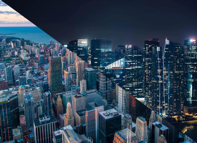
3.如何创建三角背景图像
当我们想展示某些完全不同的选择(例如白天和黑夜或冬天和夏天)时。
这是通过为整个视口创建两个div来完成的,然后需要向它们两个都添加背景图像,然后,第二个div需要一个clip-path属性才能创建三角形。
<body>
  <div class="day"></div>
  <div class="night"></div>
</body>
body {
margin: 0;
padding: 0;
}
div {
position: absolute;
height: 100vh;
width: 100vw;
}
.day {
background-image: url("https://images.unsplash.com/photo-1477959858617-67f85cf4f1df?ixlib=rb-1.2.1&ixid=eyJhcHBfaWQiOjEyMDd9&auto=format&fit=crop&w=2613&q=80");
background-size: cover;
background-repeat: no-repeat;
}
.night {
background-image: url("https://images.unsplash.com/photo-1493540447904-49763eecf55f?ixlib=rb-1.2.1&ixid=eyJhcHBfaWQiOjEyMDd9&auto=format&fit=crop&w=2250&q=80");
background-size: cover;
background-repeat: no-repeat;
clip-path: polygon(100vw 0, 0% 0vh, 100vw 100vh);
}clip-path属性创建一个裁剪区域,该区域设置应显示元素的哪一部分。区域内的部分显示,区域外的隐藏。
4.如何在我的背景图像上添加渐变叠加、
想在图像上放置一些文本但背景太浅文本显示不清晰时,它会很有用,同时它也可以改善图像本身
body {
  background-image:
    linear-gradient(4deg, rgba(38,8,31,0.75) 30%, rgba(213,49,127,0.3) 45%, rgba(232,120,12,0.3) 100%),
    url("https://images.unsplash.com/photo-1503803548695-c2a7b4a5b875?ixlib=rb-1.2.1&auto=format&fit=crop&w=2250&q=80");
  background-size: cover;
  background-repeat: no-repeat;
  background-attachment: fixed;
  background-position: center
}
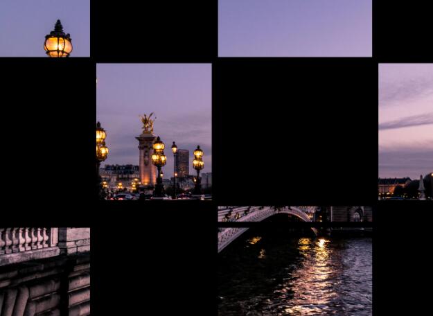
5.如何制作网格背景图片
使用CSS网格和CSS背景图像创建一个不错的背景图像
<body>
<div class="container">
  <div class="item_img"></div>
  <div class="item"></div>
  <div class="item_img"></div>
  <div class="item"></div>
  <div class="item"></div>
  <div class="item_img"></div>
  <div class="item"></div>
  <div class="item_img"></div>
  <div class="item"></div>
  <div class="item"></div>
  <div class="item_img"></div>
  <div class="item"></div>
  <div class="item_img"></div>
  <div class="item"></div>
  <div class="item_img"></div>
  <div class="item"></div>
</div>
</body>
body {
margin: 0;
padding: 0;
}
.container {
position: absolute;
width: 100%;
height: 100%;
background: black;
display: grid;
grid-template-columns: 25fr 30fr 40fr 15fr;
grid-template-rows: 20fr 45fr 5fr 30fr;
grid-gap: 20px;
.item_img {
background-image: url('https://images.unsplash.com/photo-1499856871958-5b9627545d1a?ixlib=rb-1.2.1&ixid=eyJhcHBfaWQiOjEyMDd9&auto=format&fit=crop&w=2207&q=80');
background-repeat: no-repeat;
background-position: center;
background-attachment: fixed;
background-size: cover;
}
}
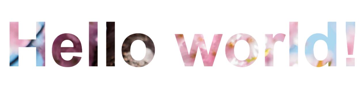
6.如何将背景图像设置为文本颜色
通过将背景图像与背景剪辑配合使用,可以实现背景图像对文字的优美效果。在某些情况下,它可能非常有用,尤其是当您想创建一个较大的文本标题但又不如普通颜色那么枯燥时。
<body>
  <h1>Hello world!</h1>
</body>
body {
display: flex;
align-items: center;
justify-content: center;
flex-direction: column;
width: 100%;
text-align: center;
min-height: 100vh;
font-size: 120px;
}
h1 {
background-image: url("https://images.unsplash.com/photo-1462275646964-a0e3386b89fa?ixlib=rb-1.2.1&ixid=eyJhcHBfaWQiOjEyMDd9&auto=format&fit=crop&w=2600&q=80");
background-clip: text;
-webkit-background-clip: text;
color: transparent;
}
本文内容仅供个人学习/研究/参考使用,不构成任何决策建议或专业指导。分享/转载时请标明原文来源,同时请勿将内容用于商业售卖、虚假宣传等非学习用途哦~感谢您的理解与支持!
10 个独特的 CSS 背景视觉效果
这几年的web设计中,大背景的设计变得越来越流行。特别是在现在大屏大行其道的情况下,设计师在设计中越来越多的使用大分辨率的背景图来填充屏幕,这样更能制造独特的视觉效果,能更好的传达他们想要向用户传达的内容。
css条纹背景样式、及方格斜纹背景的实现
通过CSS中的linear-gradient主要就能显示出不同方向的条纹效果,这里我们就来详解CSS制作Web页面条纹背景样式的技巧,需要的朋友可以参考下
微信小程序背景图为什么显示不出来?解决背景图片显示问题
在调试工具上都是可以显示的,但是扫面上传到手机上却显示不出来,这是为什么呢?这是由于:background-image 只能用网络url或者base64图片编码 , 本地图片只能用 image标签src属性才行。
css sprite
提高首评加载速度,除了要将所有使用的图片,资源文件压缩,添加懒加载,还需要合并页面中使用到的所有图标到一张大图里,减少请求次数,所有图标放到一张大图上,使用background定位
CSS3背景 background-size
设置背景图片的大小,以长度值或百分比显示,还可以通过cover和contain来对图片进行伸缩。auto:默认值,不改变背景图片的原始高度和宽度;contain:容纳,即将背景图片等比缩放至某一边紧贴容器边缘为止。
CSS box-sizing与background-clip解决背景显示范围的问题
过去在学习CSS的时候,首要任务就是要理解“box model”,因为box model是CSS里头很重要的模型概念,描述了padding、margin、border与content的空间定位
css背景图充满整个屏幕
我想让整个界面有一个背景图片,自然想到的是在body上加background,加载背景图 ;背景图垂直、水平均居中;当内容高度大于图片高度时,背景图像的位置相对于viewport固定 ;
详解如何给背景图片加颜色遮罩
前段时间在开发中,遇到需要给背景层加颜色遮罩的项目,现在特定总结一下给背景图层加颜色遮罩的方法。方法一:通过定位叠加(注意层级)
canvas 生成页面水印,MutationObserver 控制节点防修改
网上浏览的时候。看到有些页面会有背景的水印效果,使用canvas实现了个类似的效果,可以作为背景,也可以作为页面前景覆盖,防止网页信息的截图
background 设置文本框背景图
background 属性的作用是给元素设置背景,它是一个复合属性,常用的子属性如下:background-color 指定元素的背景颜色。background-image 指定元素的背景图像。
内容以共享、参考、研究为目的,不存在任何商业目的。其版权属原作者所有,如有侵权或违规,请与小编联系!情况属实本人将予以删除!