html5+css3响应式垂直时间轴,使用了HTML5标签<section>,时间轴中所有的内容包括标题、简介、时间和图像都放在.cd-timeline-block的DIV中,多个DIV形成一个序列,并把这些DIV放在<section>中。
PC端:
移动端:
html代码:
<!DOCTYPE HTML>
<html>
<head>
<meta charset="utf-8">
<meta name="viewport" content="width=device-width, initial-scale=1.0">
<title>演示:HTML5+CSS3响应式垂直时间轴</title>
<link rel="stylesheet" href="style.css" />
<style type="text/css">
h2.top_title {
border-bottom: none;
background: none;
text-align: center;
line-height: 32px;
font-size: 20px
}
h2.top_title span {
font-size: 12px;
color: #666;
font-weight: 500
}
</style>
</head>
<body>
<h2 class="top_title">HTML5+CSS3响应式垂直时间轴<br/><span>请使用IE9+或Chrome,Firefox高级浏览器或手机访问本页</span></h2>
<section id="cd-timeline" class="cd-container">
<div class="cd-timeline-block">
<div class="cd-timeline-img cd-picture">
<img src="img/cd-icon-picture.svg" alt="Picture">
</div>
<div class="cd-timeline-content">
<h2>HTML5+CSS3响应式垂直时间轴</h2>
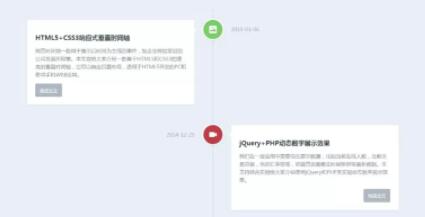
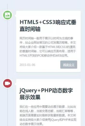
<p>网页时间轴一般用于展示以时间为主线的事件,如企业网站常见的公司发展历程等。本文将给大家介绍一款基于HTML5和CSS3的漂亮的垂直时间轴,它可以响应页面布局,适用于HTML5开发的PC和移动手机WEB应用。</p>
<a href="#" class="cd-read-more" target="_blank">阅读全文</a>
<span class="cd-date">2015-01-06</span>
</div>
</div>
<div class="cd-timeline-block">
<div class="cd-timeline-img cd-movie">
<img src="img/cd-icon-movie.svg" alt="Movie">
</div>
<div class="cd-timeline-content">
<h2>jquery+php动态数字展示效果</h2>
<p>我们在一些应用中需要动态展示数据,比如当前在线人数,当前交易总额,当前汇率等等,前端页面需要实时刷新获取最新数据。本文将结合实例给大家介绍使用jQuery和PHP来实现动态数字展示效果。</p>
<a href="#" class="cd-read-more" target="_blank">阅读全文</a>
<span class="cd-date">2014-12-25</span>
</div>
</div>
<div class="cd-timeline-block">
<div class="cd-timeline-img cd-picture">
<img src="img/cd-icon-picture.svg" alt="Picture">
</div>
<div class="cd-timeline-content">
<h2>PHP操作Session和Cookie</h2>
<p>我们跟踪用户信息时需要用到Session和Cookie,比如用户登录验证、记录用户浏览历史,存储购物车数据,限制用户会话有效时间等。今天我们来了解下PHP是如何操作Session和Cookie的。</p>
<a href="#" class="cd-read-more" target="_blank">阅读全文</a>
<span class="cd-date">2014-12-20</span>
</div>
</div>
<div class="cd-timeline-block">
<div class="cd-timeline-img cd-movie">
<img src="img/cd-icon-movie.svg" alt="Movie">
</div>
<div class="cd-timeline-content">
<h2>jQuery数字加减插件</h2>
<p>我们在网上购物提交订单时,在网页上一般会有一个选择数量的控件,要求买家选择购买商品的件数,开发者会把该控件做成可以通过点击实现加减等微调操作,当然也可以直接输入数字件数。本文将介绍常见的几种使用spinner数字微调器来实现数字加减的功能的方法。</p>
<a href="#" class="cd-read-more" target="_blank">阅读全文</a>
<span class="cd-date">2014-12-14</span>
</div>
</div>
<div class="cd-timeline-block">
<div class="cd-timeline-img cd-movie">
<img src="img/cd-icon-location.svg" alt="Location">
</div>
<div class="cd-timeline-content">
<h2>收集整理的非常有用的PHP函数</h2>
<p>项目中经常会需要一些让人头疼的函数,作为开发者应该整理一个自己的函数库,在需要之时复制过来即可。本文作者收集整理数十个PHP项目中常用的函数,保证能正常运行,你只要复制粘贴到你项目中即可。</p>
<a href="#" class="cd-read-more" target="_blank">阅读全文</a>
<span class="cd-date">2014-12-05</span>
</div>
</div>
</section>
</body>
</html>css代码
<style>
	html * {
		-webkit-font-smoothing: antialiased;
		-moz-osx-font-smoothing: grayscale;
	}
	*,*:after,*:before {
		-webkit-box-sizing: border-box;
		-moz-box-sizing: border-box;
		box-sizing: border-box;
	}
	body {
		font-size: 100%;
		color: #7f8c97;
		background-color: #e9f0f5;
	}
	img {
		max-width: 100%;
	}
	/* --------------------------------Modules - reusable parts of our design-------------------------------- */
	.cd-container {
		/* this class is used to give a max-width to the element it is applied to, and center it horizontally when it reaches that max-width */
		width: 90%;
		max-width: 1170px;
		margin: 0 auto;
	}
	.cd-container::after {
		/* clearfix */
		content: '';
		display: table;
		clear: both;
	}
	/* --------------------------------Main components-------------------------------- */
	#cd-timeline {
		position: relative;
		padding: 2em 0;
		margin-top: 2em;
		margin-bottom: 2em;
	}

	#cd-timeline::before {
		/* this is the vertical line */
		content: '';
		position: absolute;
		top: 0;
		left: 18px;
		height: 100%;
		width: 4px;
		background: #d7e4ed;
	}

	@media only screen and (min-width: 1170px) {
		#cd-timeline {
			margin-top: 3em;
			margin-bottom: 3em;
		}
		#cd-timeline::before {
			left: 50%;
			margin-left: -2px;
		}
	}

	.cd-timeline-block {
		position: relative;
		margin: 2em 0;
	}

	.cd-timeline-block:after {
		content: "";
		display: table;
		clear: both;
	}
	.cd-timeline-block:first-child {
		margin-top: 0;
	}
	.cd-timeline-block:last-child {
		margin-bottom: 0;
	}
	@media only screen and (min-width: 1170px) {
		.cd-timeline-block {
			margin: 4em 0;
		}
		.cd-timeline-block:first-child {
			margin-top: 0;
		}
		.cd-timeline-block:last-child {
			margin-bottom: 0;
		}
	}
	.cd-timeline-img {
		position: absolute;
		top: 0;
		left: 0;
		width: 40px;
		height: 40px;
		border-radius: 50%;
		box-shadow: 0 0 0 4px white, inset 0 2px 0 rgba(0, 0, 0, 0.08), 0 3px 0 4px rgba(0, 0, 0, 0.05);
	}
	.cd-timeline-img img {
		display: block;
		width: 24px;
		height: 24px;
		position: relative;
		left: 50%;
		top: 50%;
		margin-left: -12px;
		margin-top: -12px;
	}
	.cd-timeline-img.cd-picture {
		background: #75ce66;
	}
	.cd-timeline-img.cd-movie {
		background: #c03b44;
	}
	.cd-timeline-img.cd-location {
		background: #f0ca45;
	}
	@media only screen and (min-width: 1170px) {
		.cd-timeline-img {
			width: 60px;
			height: 60px;
			left: 50%;
			margin-left: -30px;
			/* Force Hardware Acceleration in WebKit */
			-webkit-transform: translateZ(0);
			-webkit-backface-visibility: hidden;
		}
		.cssanimations .cd-timeline-img.is-hidden {
			visibility: hidden;
		}
		.cssanimations .cd-timeline-img.bounce-in {
			visibility: visible;
			-webkit-animation: cd-bounce-1 0.6s;
			-moz-animation: cd-bounce-1 0.6s;
			animation: cd-bounce-1 0.6s;
		}
	}
	.cd-timeline-content {
		position: relative;
		margin-left: 60px;
		background: white;
		border-radius: 0.25em;
		padding: 1em;
		box-shadow: 0 3px 0 #d7e4ed;
	}
	.cd-timeline-content:after {
		content: "";
		display: table;
		clear: both;
	}
	.cd-timeline-content h2 {
		color: #303e49;
	}
	.cd-timeline-content p,.cd-timeline-content .cd-read-more,.cd-timeline-content .cd-date {
		font-size: 13px;
		font-size: 0.8125rem;
	}
	.cd-timeline-content .cd-read-more,.cd-timeline-content .cd-date {
		display: inline-block;
	}
	.cd-timeline-content p {
		margin: 1em 0;
		line-height: 1.6;
	}
	.cd-timeline-content .cd-read-more {
		float: right;
		padding: .8em 1em;
		background: #acb7c0;
		color: white;
		border-radius: 0.25em;
	}
	.no-touch .cd-timeline-content .cd-read-more:hover {
		background-color: #bac4cb;
	}
	a.cd-read-more:hover {
		text-decoration: none;
		background-color: #424242;
	}
	.cd-timeline-content .cd-date {
		float: left;
		padding: .8em 0;
		opacity: .7;
	}
	.cd-timeline-content::before {
		content: '';
		position: absolute;
		top: 16px;
		right: 100%;
		height: 0;
		width: 0;
		border: 7px solid transparent;
		border-right: 7px solid white;
	}
	@media only screen and (min-width: 768px) {
		.cd-timeline-content h2 {
			font-size: 20px;
			font-size: 1.25rem;
		}
		.cd-timeline-content p {
			font-size: 16px;
			font-size: 1rem;
		}
		.cd-timeline-content .cd-read-more,.cd-timeline-content .cd-date {
			font-size: 14px;
			font-size: 0.875rem;
		}
	}

	@media only screen and (min-width: 1170px) {
		.cd-timeline-content {
			margin-left: 0;
			padding: 1.6em;
			width: 45%;
		}
		.cd-timeline-content::before {
			top: 24px;
			left: 100%;
			border-color: transparent;
			border-left-color: white;
		}
		.cd-timeline-content .cd-read-more {
			float: left;
		}
		.cd-timeline-content .cd-date {
			position: absolute;
			width: 100%;
			left: 122%;
			top: 6px;
			font-size: 16px;
			font-size: 1rem;
		}
		.cd-timeline-block:nth-child(even) .cd-timeline-content {
			float: right;
		}
		.cd-timeline-block:nth-child(even) .cd-timeline-content::before {
			top: 24px;
			left: auto;
			right: 100%;
			border-color: transparent;
			border-right-color: white;
		}
		.cd-timeline-block:nth-child(even) .cd-timeline-content .cd-read-more {
			float: right;
		}
		.cd-timeline-block:nth-child(even) .cd-timeline-content .cd-date {
			left: auto;
			right: 122%;
			text-align: right;
		}
		.cssanimations .cd-timeline-content.is-hidden {
			visibility: hidden;
		}
		.cssanimations .cd-timeline-content.bounce-in {
			visibility: visible;
			-webkit-animation: cd-bounce-2 0.6s;
			-moz-animation: cd-bounce-2 0.6s;
			animation: cd-bounce-2 0.6s;
		}
	}
	@media only screen and (min-width: 1170px) {
		/* inverse bounce effect on even content blocks */
		.cssanimations .cd-timeline-block:nth-child(even) .cd-timeline-content.bounce-in {
			-webkit-animation: cd-bounce-2-inverse 0.6s;
			-moz-animation: cd-bounce-2-inverse 0.6s;
			animation: cd-bounce-2-inverse 0.6s;
		}
	}
</style>
移动端web app要使用rem实现自适应布局:font-size的响应式
rem是相对于根元素html,这样就意味着,我们只需要在根元素确定一个px字号,则可以来算出元素的宽高。
使用现代CSS的响应式版面
通过模块化缩放,使用传统属性和calc()来动态缩放你的字体大小.为字体大小使用百分比.给文本内容和媒体查询使用em,针对不同视口尺寸使用不同缩放值.视口越小,缩放比例越小,使用媒体查询或者media()函数基于视口来改变比例和基础字号
web响应式图片的5种实现
在目前的前端开发中,我们经常需要进行响应式的网站开发。本文着重介绍一下弹性图片,也就是响应式图片的解决方案:js或服务端、srcset 、sizes 、picture标签、svg图片
实现响应式_CSS变量
CSS 变量是 CSS 引入的一个新特性,目前绝大多数浏览器已经支持了,它可以帮助我们用更少的代码写出同样多的样式,大大提高了工作效率,本篇文章将教你如何使用 CSS 变量(css variable)。CSS中原生的变量定义语法是:--*,变量使用语法是:var(--*),其中*表示变量名称
vue响应式原理及依赖收集
Vue通过设定对象属性的setter/getter方法来监听数据的变化,通过getter进行依赖收集,而每个setter方法就是一个观察者,在数据变更的时候通知订阅者更新视图。
vue响应式系统--observe、watcher、dep
Vue 最独特的特性之一,是其非侵入性的响应式系统。数据模型仅仅是普通的JavaScript 对象,而当你修改它们时,视图会进行更新,这使得状态管理非常简单直接,我们可以只关注数据本身

Responsive Web Design 响应式网页设计
常见的布局方案:固定布局:以像素作为页面的基本单位,不管设备屏幕及浏览器宽度,只设计一套尺寸;可切换的固定布局:同样以像素作为页面单位,参考主流设备尺寸
响应式布局的实现
响应式布局,即 Responsive design,在实现不同屏幕分辨率的终端上浏览网页的不同展示方式。通过响应式设计能使网站在手机和平板电脑上有更好的浏览阅读体验。响应式布局的关键不仅仅在于布局
深入响应式原理
说到响应式原理其实就是双向绑定的实现,说到 双向绑定 其实有两个操作,数据变化修改dom,input等文本框修改值的时候修改数据1. 数据变化 -> 修改dom;2. 通过表单修改value -> 修改数据
媒体类型和响应式设计
常用的三种为:all,print和screen;媒体类型引用方法:link标签,xml方式,@import和css3新增的@media四种
内容以共享、参考、研究为目的,不存在任何商业目的。其版权属原作者所有,如有侵权或违规,请与小编联系!情况属实本人将予以删除!